adobe, 2024
scaling image masking flows to accommodate 20+ new preset masks on photoshop express

Team
Design manager
Product manager
2 Engineers
My role
Conceptualization
Design
Usability testing
Dev handoff
duration
2 months
background
initially, we offered 3 preset masks, now we offered 20+
impact
The new masks expanded the horizon for editing images and led to significant free to premium conversions.
5%
Increase in conversion of free users to premium
40%
Throughput of selection of objects in the image
27%
Throughput of selection of skin in the image
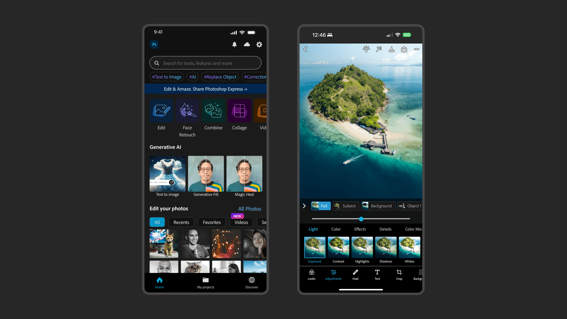
But what is photoshop express?
Photoshop Express is a mobile-only photo and video editing app helping social media enthusiasts express their creativity without going through complex workflows.
users masked image areas using preset mask pills
So smol right? I know.

the problem
Adding more mask options in the strip caused excessive scrolling
This meant most masks towards the end of the strip suffered discoverability issues because let's face it, who's gonna scroll that much?

the process
Surprisingly, no other apps were providing as many masks!
Out of the 10 studied, only 2 even provided masking options.

let's start with what we have - the strip
I modified the same strip to see how well it will function with 20+ masks. I categorized those masks into relevant groups and nested its contents within them.

The strip overlaps key image areas, making mask refinement and brushing difficult.
Small mask previews make decision making difficult.
Selecting multiple masks gets tricky in a small cramped space.
getting inspired from e-commerce apps
Aren’t masks just 'filters' on the image? Let’s see a few filtering patterns commonly seen in e-commerce apps:

e-commerce filtering patterns for selecting masks
While effective for organizing masks, the lack of previews forces users to guess what particular areas on the image labels like ‘Object 1’ refer to.

Improved mask organization.
Users are left to blindly select masks, relying on trial and error due to missing previews.
Making the masks more visible
Now, the users can see exactly what area of the image is covered within the mask they're selecting.

Bigger mask previews aid accurate selection.
Shown organization of masks leads to a long vertical scroll, hampers search and discovery.
introducing better navigation
The navigation pills are categories in which the masks are organized. Tapping on a pill auto-scrolls the list to the first item in the category.

Improved navigation makes browsing faster.
Bottom-sheet takes up ~50% of the screen space, shrinking the image too much.
finalising the design
Leveraging an existing pattern
The pattern of two levels of navigation was used in other tools in the editor workspace in majority, which mitigated the pitfalls of the previous iterations.

Retained category-based navigation, affording fast browsing.
Reduced bottom-sheet height = Larger image preview.
Improved learnability due to an existing pattern being used.
brushing a new mask
The Add Selection option lets the user brush their own mask. Custom masks are saved separately as their own category.

refining a preset mask
If a mask is selected, the Add Selection menu item turns into the Refine Selection menu item, helping the user add or subtract areas from the mask to refine it.

signing off!
key takeaways
This project was jam-packed with a lot of work, exploration and discussion with stakeholders. It feels almost impossible to boil down my learning, but if I had to, here they are!
looking out of the box
Boiling down the requirement to its core user need, and drawing metaphors helped me get inspired from apps outside the domain, bringing in a fresh perspective to the experience even though the concept was rejected.
challenges of scale
I understood how scale can affect interaction in such a small real estate and learnt about how certain interactions and patterns can guide user behavior.